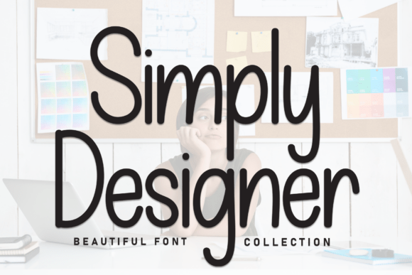
Simply Designer: A Display Font for Expressive Web Identity
As a UI designer who ships digital products daily, I reach for display fonts not just for flair—but for function. Simply Designer stands out because it delivers personality without sacrificing clarity. It’s a hand-crafted display font with rhythmic curves, subtle bounce, and balanced spacing—designed to feel joyful yet intentional. Not overly ornate, not sterile—it lands right where expressive branding meets web usability.
This isn’t a body text font. It’s a voice: the kind you’d use to introduce a new course, headline a boutique product launch, or anchor a creative portfolio’s hero section. Its letterforms carry whimsy but stay legible at scale—especially when sized 32px and up on desktop, or 28px+ on mobile viewports. That balance makes Simply Designer unusually versatile for a display typeface: it works in high-contrast settings (white text on deep indigo), overlays cleanly on soft image gradients, and holds its own against busy background textures—provided contrast ratios meet WCAG 2.1 AA standards.
Where Simply Designer Earns Its Place in Your Layout
In real-world web projects, Simply Designer shines where attention and tone matter most:
- Hero sections: Use it for primary headlines—especially on SaaS landing pages or coaching sites where warmth and approachability reinforce trust.
- Landing page CTAs: Short action phrases like “Start Designing” or “Join the Studio” gain memorability when set in Simply Designer, particularly over minimalist backgrounds.
- Online store banners: For limited-edition drops or seasonal collections, it adds editorial charm without competing with product imagery.
- Course or workshop headers: Paired with clean sans serif body copy, it signals creativity and human-centered learning—not corporate templating.
- Portfolio site titles: On a designer’s personal site, it subtly communicates craft and intentionality before the first case study loads.
It’s less effective for navigation labels, form fields, or paragraph text—even at larger sizes. Its decorative energy works best in controlled doses: one prominent headline per screen, or as a recurring typographic motif across branded assets like email headers, social media story templates, or digital brand kits.
Readability & Responsiveness: Practical Considerations
On mobile, Simply Designer remains legible down to ~24px—but only if line height is generous (1.4–1.6) and letter spacing is slightly opened (+20–30 units in variable font setups or via CSS letter-spacing). Avoid tight tracking or all-caps usage on small screens; those choices erode scannability. Also test contrast carefully on dark mode interfaces—some lighter weights may need a subtle text shadow or background tint for accessibility.
When layered over images, apply a soft semi-transparent overlay (e.g., black at 20% opacity) behind the text block. This preserves Simply Designer’s delicate details while ensuring readability across diverse photo lighting conditions.
Smart Pairing for Digital Clarity
Display fonts thrive when paired with purpose-built companions. For web interfaces, I consistently pair Simply Designer with a neutral, highly legible sans serif—like Inter, Manrope, or IBM Plex Sans. These provide rhythm, breathing room, and functional hierarchy: Simply Designer sets the emotional tone; the sans serif handles information flow.
For editorial or luxury-leaning digital experiences—think blogs, newsletters, or premium subscription sites—a restrained serif (such as Cormorant Garamond or Literata) can deepen sophistication. Just keep serif usage to subheadings or pull quotes; let Simply Designer retain focus as the signature voice.
Licensing, Formats & Real-World Deployment
Simply Designer ships as a web-optimized font family with WOFF2 support, making it fast-loading and compatible across modern browsers. Check whether your license includes self-hosting rights—critical for client sites, SaaS dashboards, and e-commerce platforms where third-party font hosts may pose privacy or performance concerns.
The package includes standard OpenType features: discretionary ligatures, stylistic alternates, and multilingual Latin character support (covering Western, Central, and Eastern European languages). No Cyrillic or Arabic glyphs—so verify language needs early if targeting broader global audiences.
Commercial licensing covers usage across websites, landing pages, online stores, digital ads, and downloadable brand assets—including client deliverables. But note: embedding in mobile apps or desktop software typically requires an extended license. Always review the terms before bundling into templates or white-labeled products.
Building Consistent Digital Identity
Type is one of the most repeatable brand touchpoints—and Simply Designer becomes a quiet anchor when used intentionally. On a boutique skincare site, it might appear only in the logo lockup and hero headline, then reappear sparingly in seasonal campaign graphics. On a design educator’s platform, it could define course titles, testimonial accents, and email subject lines—creating cohesion across channels without visual fatigue.
That consistency isn’t about repetition—it’s about recognition. When users see Simply Designer in context, they’re not just reading words. They’re sensing a point of view: thoughtful, human-scaled, creatively confident. In a landscape saturated with generic system fonts and overused Google Fonts, that distinction translates directly to engagement, recall, and conversion.
So yes—Simply Designer is a display font. But more precisely, it’s a tool for shaping how people feel before they even scroll past the fold.